23 articles
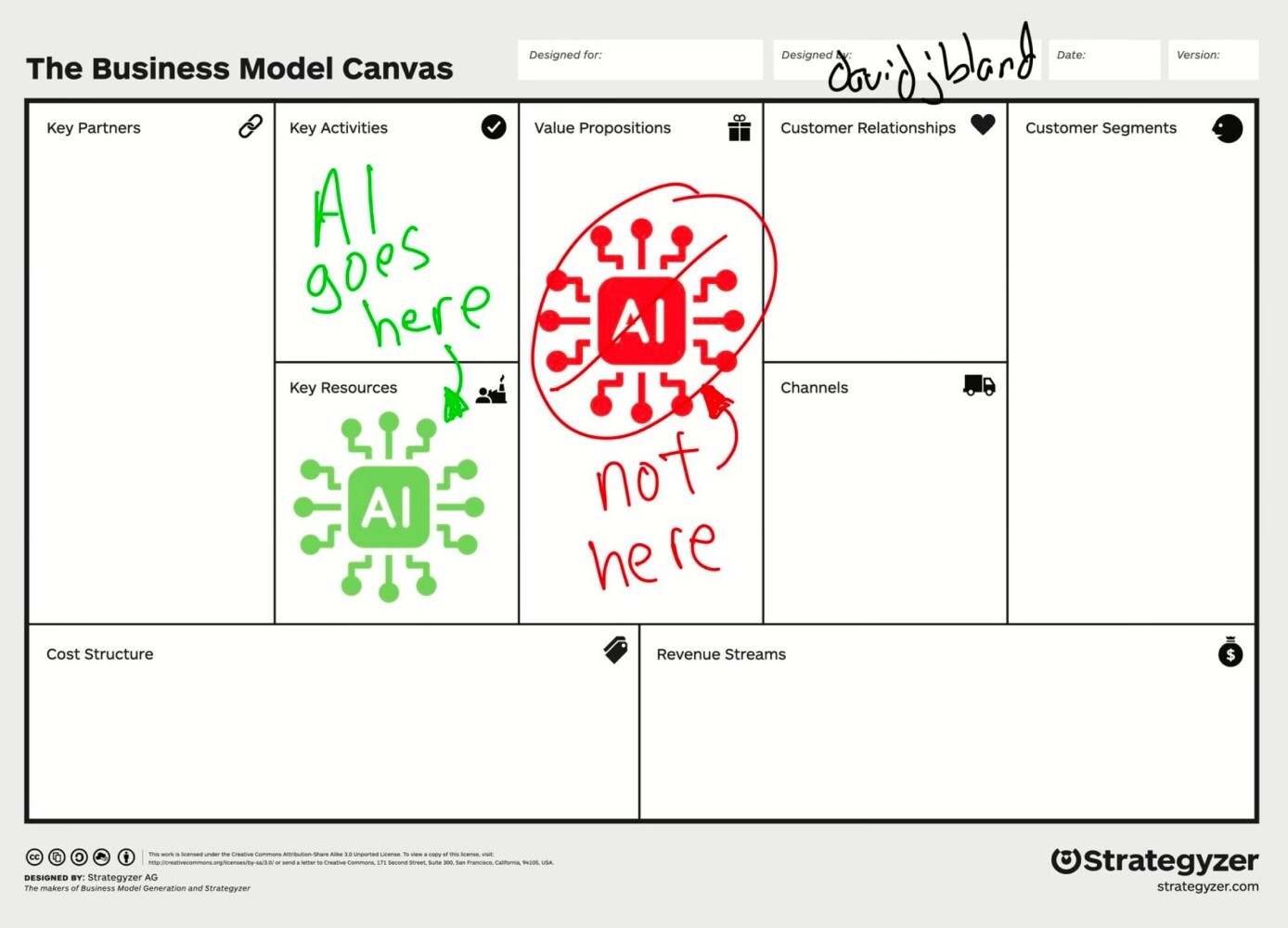
Strong UX ideas do not secure investment on their own. Through a worked example, Alex Williams breaks down how to define business value, calculate costs, test causality, and build a credible case for the return on a design initiative. - UX - Design - Business
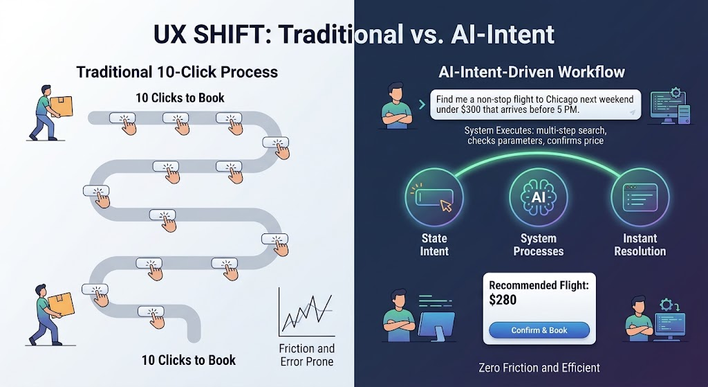
TThe web is evolving beyond menus, forms, and endless clicks toward experiences shaped around human intent. For UX designers, understanding this shift means re-evaluating their role, moving from designing visible interfaces to guiding transparent, intent-driven AI experiences.
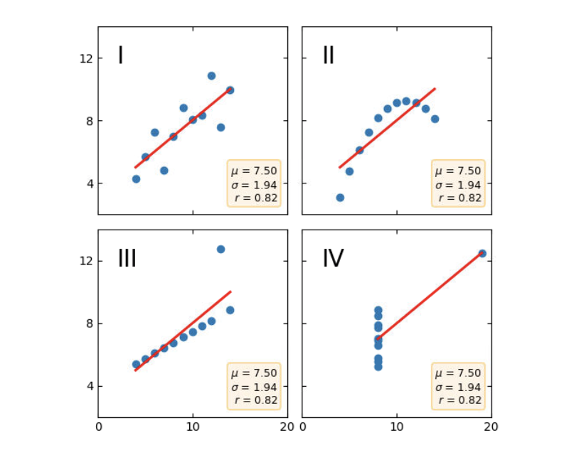
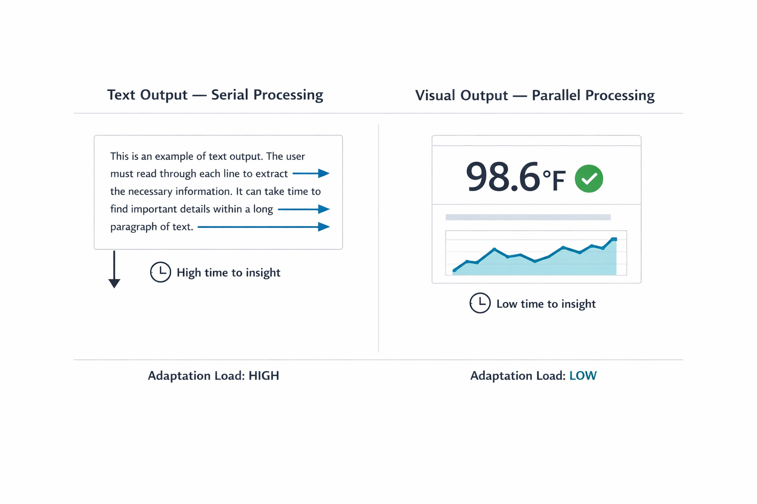
Data visualisation sits at the intersection of two disciplines that rarely talk to each other: data and design. Meriem Benhabiles explores what changes when you bring structured UX thinking to dashboards and data presentations, from the questions you ask before opening any tool to the decisions that determine whether an insight actually lands.
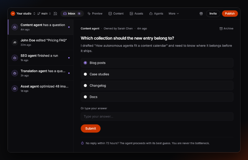
Every website peaks on launch day and slowly drifts from there, not because it breaks, but because nobody has time to keep it current. Autonomous websites, continuously optimized by agents after launch, aim to change that. Pierre Burgy shares what they learned building for full website autonomy and the deeper design problem they uncovered along the way.
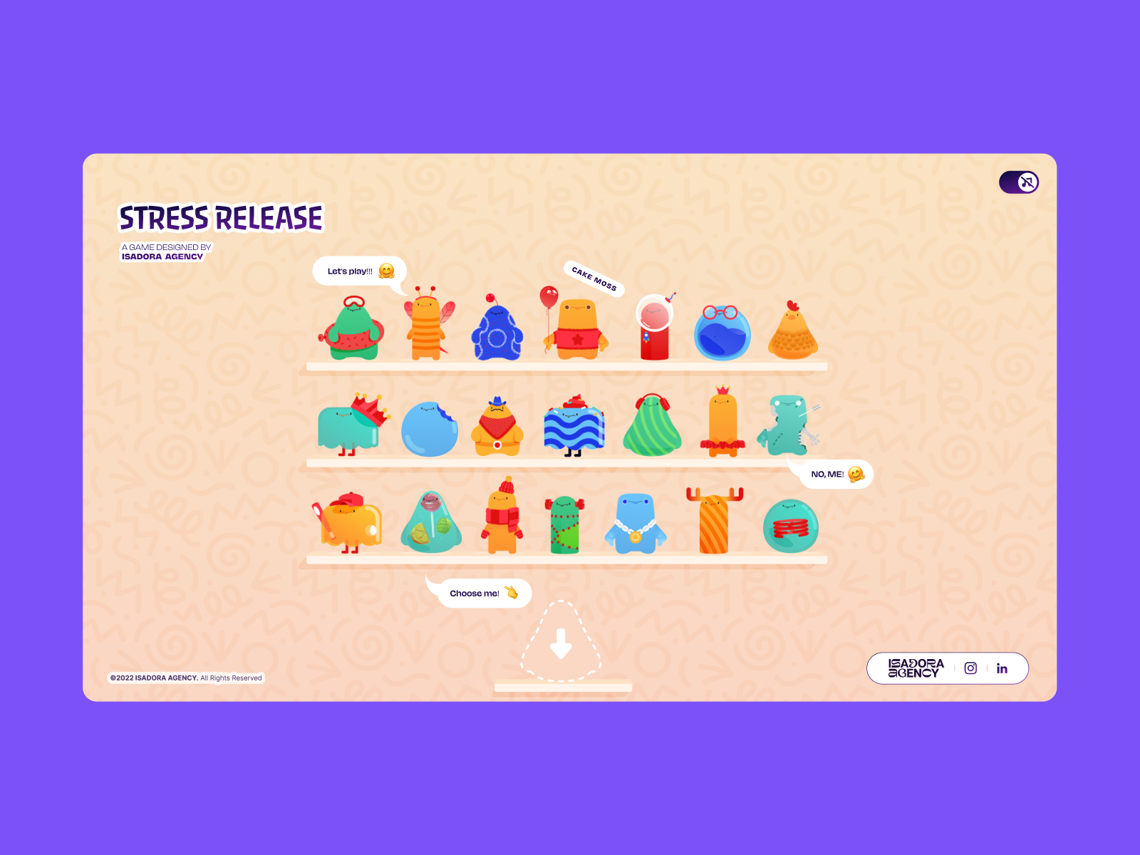
When tasked with building a highly interactive, tactile web experience, the architecture must serve the art direction. In this article, Alexey Kopytin explains their architectural rationale for building a digital stress-relief squeeze toy game using Lottie animations, DOM events, and distance-based math to maintain absolute control over their designers’ intentional motion.
As AI reshapes product design, it could give designers greater autonomy or expose the gaps that autonomy makes harder to hide. Exploring both the bull and bear cases, Andy Budd examines what happens when designers need less permission to act.
Many of the AI tools we interact with take the form of text boxes. But what if there was a different way to interact with AI? Oleksii Hrzhehorzhevskyi explores a different approach to creating a new AI assistant and how designers can navigate the field as AI continues to change it.
Many companies assume everyone craves new AI features. But the reality is that most people don't want more AI — at least not in the way most AI leaders envision it. Brought to you by Design Patterns For AI Interfaces, **friendly video courses on UX** and design patterns by Vitaly.
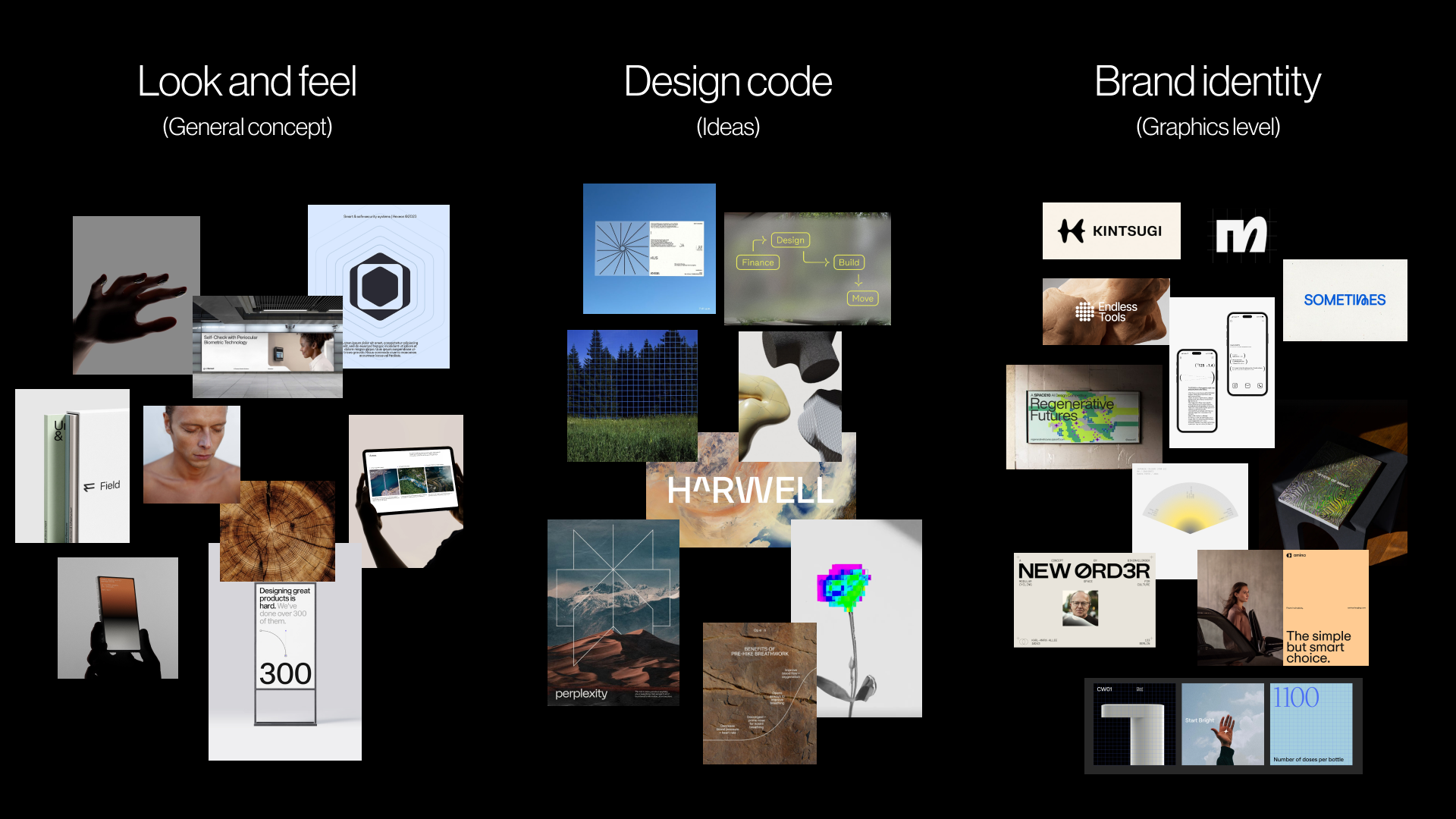
The strongest visual concepts don’t start in Figma. They start with the right questions. Explore the pre-concept phase of brand identity design, where teams research brand context, uncover hidden assumptions with stakeholders, and turn shared direction into a visual foundation before a single concept is created.
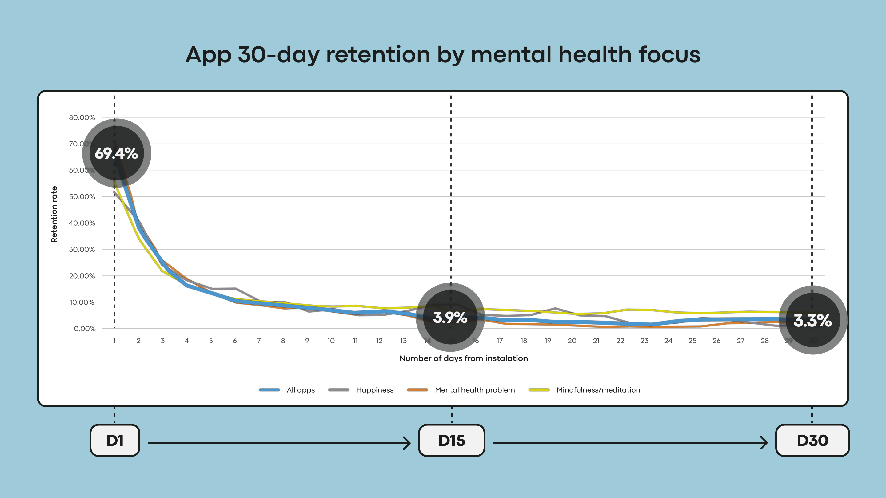
Many UI trends are designed to capture attention and signal innovation, but those goals often conflict with the needs of mental health apps: reducing cognitive strain, fostering trust, and providing a sense of refuge. Kat Homan introduces an evaluation framework that helps designers assess whether trendy visual and interaction patterns support or undermine the unique goals of mental health experiences.
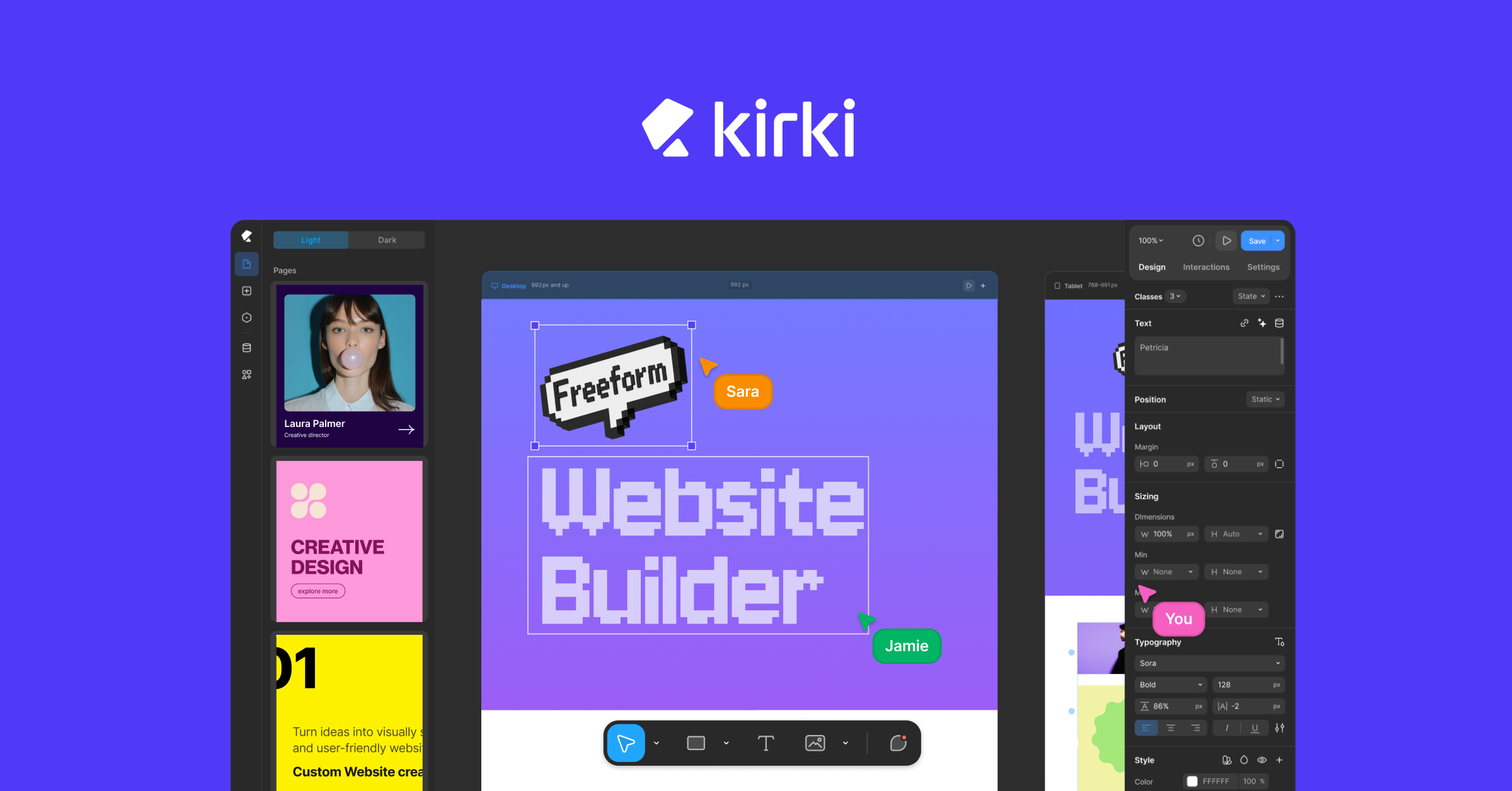
We have been building websites inside boxes for years on WordPress. Let’s take a closer look at [Kirki](https://kirki.com/), the first freeform visual builder with an infinite canvas, and explore how it redefines the experience with cleaner performance, full design freedom, and zero plugin dependency.
A closer look at why users don’t need more tools in their daily lives. What they need are seamless integrations of useful features to match already existing, established mental models. Brought to you by Design Patterns For AI Interfaces, **friendly video course on UX** and design patterns by Vitaly.
We’ve fallen into conversational tunnel vision, defaulting every AI capability into a chat-based interface simply because LLMs are trained on dialogue data. But great UX is about matching modality to users’ context, intent, and cognitive load, so the interface adapts to the user, not the other way around.
Teams can generate UI faster than ever, but they still have to guarantee that what they ship is usable, secure, and maintainable. Accessibility as an operational capability rather than a compliance checklist or end-of-project audit, and what that looks like in practice.
In a world where AI is informing more design choices, it’s easy to mistake predictions for certainties. This article introduces Probabilistic Design, a mindset that allows UX and product teams to accept uncertainty, decipher AI outputs with nuance, and make smart, adaptive decisions.
Findings from an exploratory user research study highlighting the unique insights and practical UX recommendations shared by participants with cognitive disabilities.
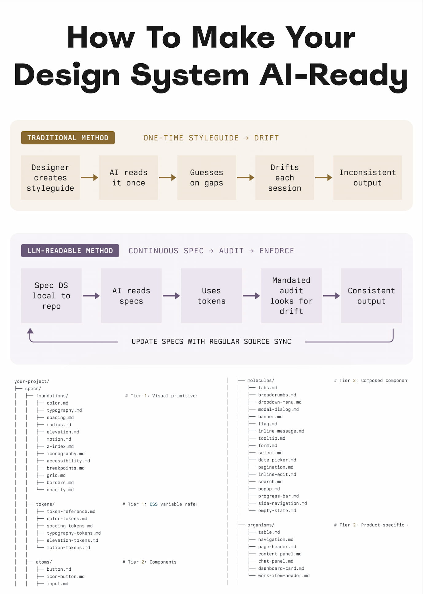
Practical guide on how to reduce drifts, minimize mistakes, maintain context, and improve the quality of AI-generated prototypes. Brought to you by Design Patterns For AI Interfaces, **friendly video course on UX** and design patterns by Vitaly.
Seventy percent of websites still fail basic WCAG contrast checks in 2025. After years of design system tooling, accessibility linters, and JavaScript libraries, nothing moved the needle. We didn’t need better libraries. We needed better CSS. `contrast-color()` is that better CSS.
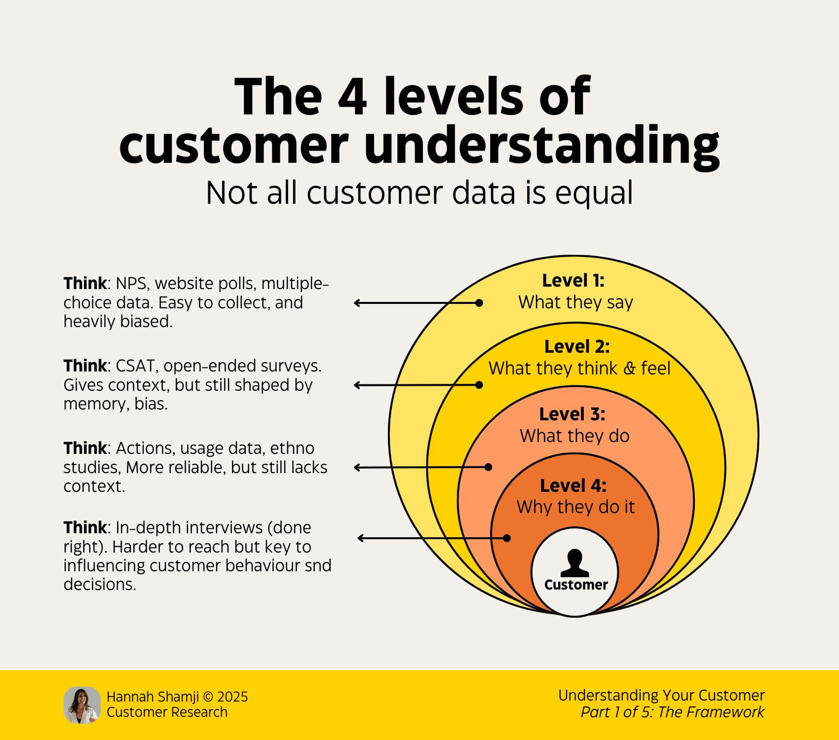
What people say, feel, think, and do are often very different things. To understand the underlying reasons for user behavior, it helps to look beyond the surface and explore hidden motivations, root causes, and the different layers of reality that shape how people act. Brought to you by Measuring UX Impact, **friendly video course on UX** and design patterns by Vitaly.
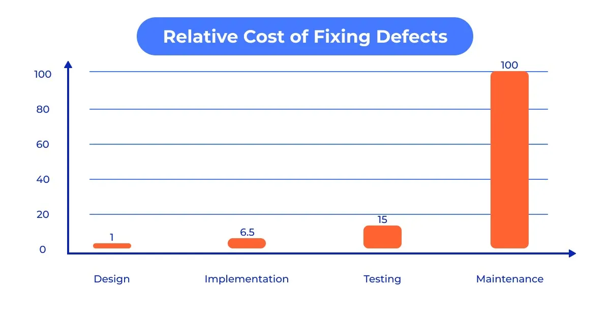
Every extra second of friction has a measurable business cost. Carrie Webster shares ten data-backed UX facts that link user experience directly to revenue, retention, and long-term growth.
Design always starts with function — function shapes form. But if that function can’t be made completely invisible and people still have to interact with it, it inevitably becomes part of their experience. In this article, Kyrylo Levashov shares four common software design assumptions.
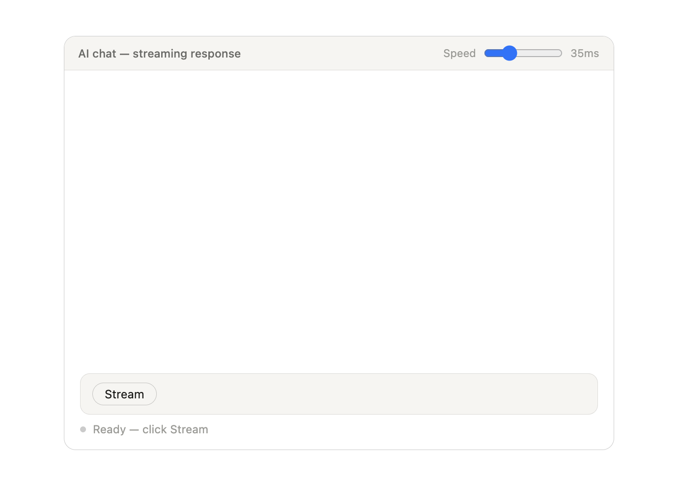
Streaming UIs are an easy concept on the surface, but are quite complicated in practice. There are many considerations that need to be accounted for, from layout shifts and motion preferences to proper markup and various states, that may not be instantly obvious. What happens if the stream is interrupted? Can users tab through the UI on the keyboard as it shifts? What ARIA attributes might be needed?
In a rush to embrace AI, the industry is redefining what it means to be a UX designer, blurring the line between design and engineering. Carrie Webster explores what’s gained, what’s lost, and why designers need to remain the guardians of the user experience.

 Signal Hub